Layout
Basics
The layout is foundation of any interface you build—it’s an aesthetic arrangement of the elements on the screen. The simplest, most efficient way of doing this is to have an underlying grid to place items on.
At Setu, we use a 24-column grid. Twenty-four, because it offers the balance between flexibility and scalability to build a vast number of screens and layouts.
Content width
Keep the overall content width to the centre half, or maybe two-thirds of the page. Reserve full-width, no-bleed sections for things like images or illustrations. In this era of wide-screen displays, full-width means really, really wide.
Of course, feel free to break this pattern when you have data-dense components such as a table.
Placement
Now that we have the grid, any element or component needs to occupy a certain number of columns—the lowest being 1, and highest being 24. But, let’s add some constraints here.
We obviously don’t want twenty-four items crammed side-by-side—aim for wholes, halves, thirds, and maybe fourths. Avoid lower divisions, unless absolutely necessary, for example, showing a list of icons.
Whole
Half
Half
Third
Third
Third
Fourth
Fourth
Fourth
Fourth
Responsiveness
In smaller devices, it makes sense to have a slightly different layout.
Keep in mind that the number of columns in the CSS grid layout in Fictoan does not change—it remains at a constant 24—just the overall width and the gutters reduce.
Make sections full-width to use the smaller small available. Use half-width sections if absolutely necessary, as content might start to feel too congested.
Whole
Whole
Half
Half
Break the monotony
Once you have the grid setup, it might seem obvious and efficient to begin placing items one after the other. While there’s nothing wrong with that, do consider breaking that pattern for more interesting layouts.
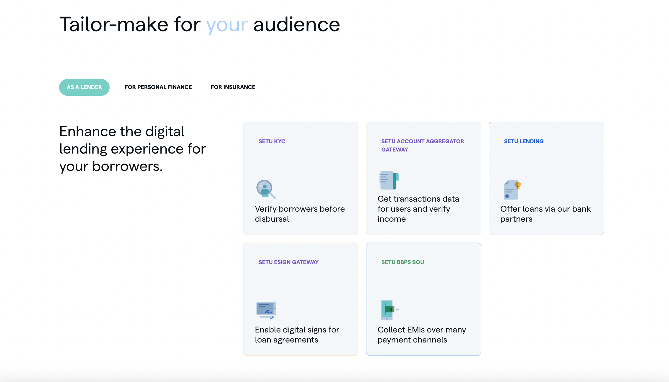
This also introduces whitespace into your design—letting the elements and components breathe.